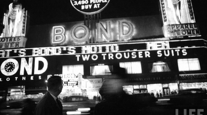
Bond Clothing Store sign was a mainstay of Times Square in the 1940s and 50s. For more on Bond’s unusual transition after that, read my article from 2007 on Bond International Casino. Picture courtesy Life Magazine, Lisa Larsen photographer
New York Neon is the Bowery Boys Book of the Month for July, a superb review of the history of neon signs in New York City and a delectable catalog of some of the finest neon works still in the city today. My full review is here.
The author Thomas E. Rinaldi also runs a great website on the subject. I asked him a few questions about the current state of New York’s most classic form of signage:
Why does the glow of a neon sign continue to endure and fascinate people over other architectural forms from the same period of the early-mid 20th century?
Thomas Rinaldi: I think a large part of the appeal of old signs is their rarity. The odds of any commercial sign lasting more than a few years are incredibly slim; for this reason, old signs really stand out, in a way that turns out to be of widespread appeal. This is especially true in NYC today, where old signs have added appeal by way of their association with old, independent businesses that have become almost an endangered species in the city of late.
How does New York’s representatives in neon compare to those in other neon-friendly cities like Las Vegas or Los Angeles?
TR: The old neon signs one finds around New York today are actually very modest compared to those of Vegas or LA, or the kind of “roadside Americana” signs one associates with Route 66. I find this interesting in and of itself. Sure, New York had its extravagant signs in places like Times Square. But most of the neon that went up in New York was relatively humble, for a variety of reasons.
First of all, there are the obvious space constraints of any urban storefront. While some pretty imaginative storefront signs appeared before WWII, the signs became increasingly spare after the War, partly because of restrictive zoning, partly because of labor costs (most of the New York sign shops were union), and – my belief – partly because of the general postwar trend away from urban centers and toward suburban development and roadside culture.
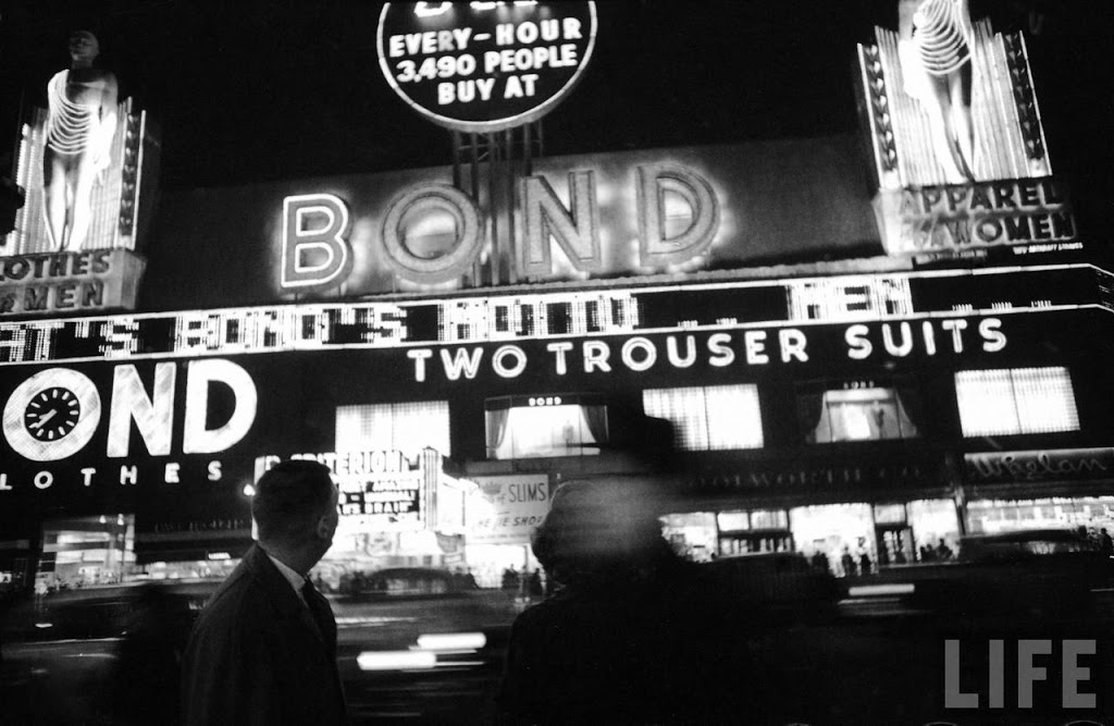
Below: The neon sign at the Village Vanguard in Greenwich Village, a facsimile of one that originally appeared here in the 1940s.
 Neon lends its appeal to a certain nostalgic image of New York. Are there any uses in classic print, TV or film that stand out to you as particularly striking?
TR: I found that the classic, iconic image of New York neon noir is spread out in little scattered fragments. There are a handful of classic noir films set in New York in which you’ll see neon in the backdrop – films like I Wake Up Screaming and Where The Sidewalk Ends. But some of the best cinematic depictions of New York’s neon heyday aren’t noir films at all: Pillow Talk, for instance, is a goofy comedy, or The Sweet Smell of Success, which is probably the single best go-to for shots of midcentury, neon-festooned New York.
Neon storefront signs were so incredibly ubiquitous in cities like New York that they crop up just about everywhere – in noir films, yes, but not just those set in New York. I would suggest that the popular association of neon with the nocturnal cityscape is not something born unto any one city, medium or genre, but a composite of scattered fragments that add up to a collective ideal.
Below: The trailer to Murder My Sweet, a wild, smoky film noir starring Dick Powell that effectively uses neon to help set the mood.
It seems the most difficult task you laid out for yourself in ‘New York Neon’ is tracking down the stories of dozens of still-extant individual signs. What’s the secret to many of these classic signs surviving for so long?
TR: To a large extent, it’s luck of the draw. But also, I found that old signs tended to be more densely collected in certain kinds of neighborhoods, like the Upper West Side or Greenwich Village. Places that could still sustain little family-owned businesses, even through the period of New York’s financial crisis. Places not too rich but not too destitute either. Now, however, they’ve become scarce even in those neighborhoods.
What’s your personal favorite New York neon sign, both of those presently existing and those from the past?
TR: Depends on what day you ask me! Ones that usually come to mind, though, are Nathan’s Famous and the Wonder Wheel out in Coney, the Dublin House on West 79th Street, Radio City Music Hall and Patsy’s Restaurant in Midtown.
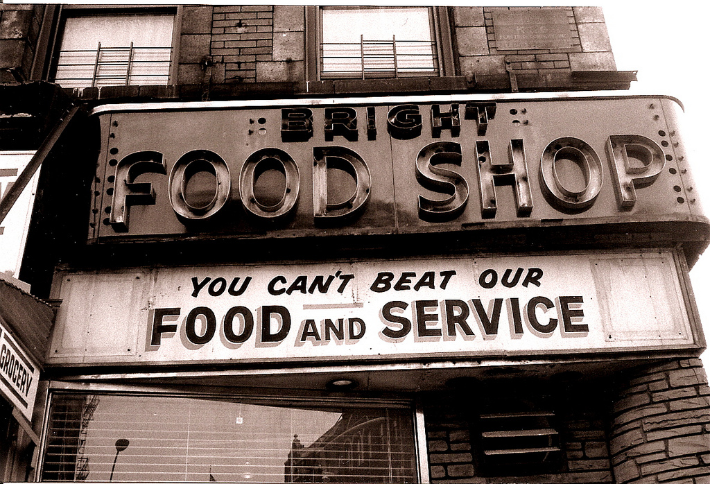
The P&G Bar sign, formerly on the Upper West Sign, is my favorite of the signs that have disappeared in recent years. I also really miss the Bright Food Shop‘s sign in Chelsea.
There were some great relics that disappeared just a little before my time – places like the Terminal Bar, across from the Port Authority Bus Terminal, or the Penn Bar & Grill, by Penn Station, that I wish I’d photographed. And then there are those that vanished long, long ago – a funny place called the “Barrel Of Fun” nightclub in the West 50s comes to mind, but really, of the thousands and thousands of neon signs that have come and gone from Manhattan alone, the list could go on almost forever.
Below: The old Bright Food Shop sign on Eighth Avenue (Photo courtesy verplanck/Flickr)
Having devoted so much time to the classic beauty of neon, does it make you a little nauseous to even look at LED sign by this point?
TR: Actually, it’s sort of the opposite. Maybe it’s just wishful thinking, but I find that LEDs have facilitated some fairly decent, interesting new signs, sort of like the early days of neon all over again – much more creative stuff than the boring, fluorescent-and-vinyl signs that have been the norm for the last few decades.
Still, LEDs have a tremendously long way to go before they could give us illuminated signage that holds a candle to typical neon storefront signs of the 1930s or 1950s, in terms of creativity and craft. Whereas neon signs were designed to be repaired rather than replaced, LEDs are essentially disposable, and it’s heartbreaking that they’ve taken such a huge toll on the neon industry around the world.
The flip side is that LEDs are an incredibly versatile artificial light source, so – maybe there’s hope for better signs down the road. But neon is still so unique that I expect it will always have a niche, even though we’ll likely be seeing less and less of it in the years to come.
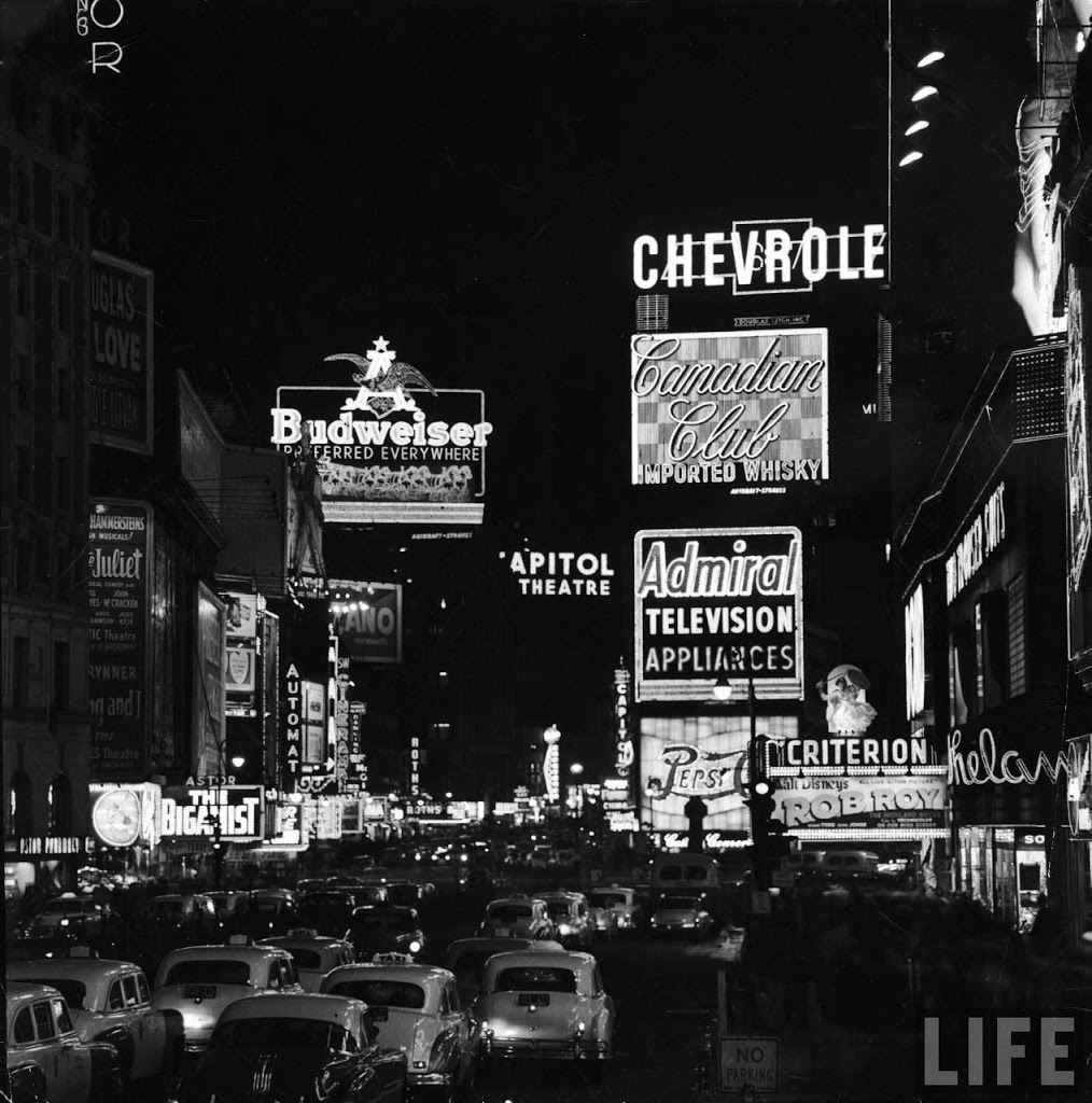
Below: Times Square 1954, photo by Andreas Feinginger (Courtesy Life)
You can hear Rinaldi discuss all things neon at his upcoming talk on Monday, July 22, at the New York Public Library’s Mid-Manhattan branch. More information here.
1 reply on “The neon bible: A chat with ‘New York Neon’ author Thomas E. Rinaldi about the city’s most stylish signs”
Great Article. Such an iconic city for the neon industry.